Looking at the Density of Comic Book Page Layouts
December 17, 2020
When creating a comic book, you have to make sure to get the balance correct. The number of panels and tiers and how narrow or wide the gutters are directly influencing your comic book page’s density.
A well laid-out page will create flow, and your reader won’t even notice some of the details on which you’ve worked so hard. However, if you ignore the details of your comic book layout, your pages will be crowded and too busy, creating an unattractive and sometimes unreadable storyline.
Anatomy of a Comics Page
When you look at a single page of a comic book, you may only see the story that the author and artist would like you to see. But if you’re creating a comic book, you need to pay special attention to the layout.
A comic book is broken down into panels, panel grids (which are also known as tiers), and gutters, and the way you create these specific elements make a significant difference in how your creation looks.
Panels
A single image or frame of action, a comic book page is made up of multiple panels, each separated by a line of space. In North America, we read left to right. Most comics created for North American readers (and other English readers) are arranged, so the eye naturally goes from left to right.
Tiers
A tier is a row of panels, also called a panel grid. Panels can either be laid out in rows or columns. For North American readers, you should strongly consider laying them out in rows instead of columns, especially if it’s your first comic, to avoid confusion.
Gutters
The white spaces between each panel are called a gutter, and there can either be horizontal or vertical gutters. Manga, which is a type of Japanese comic, typically uses no gutters at all. If you’re not creating Manga, you should opt for gutters around each of your panels and in-between the tiers.
The gutter space at the very edge of the page is essential too. If you have an 11” by 17” single page, then, with gutters, the inner content available to you will be 10” by 15”.
How to Layout Your Comic
Many artists use the System of 3s to make a comic book layout that isn’t too dense but still has tension and flow.
Split the page into thirds, with gutters running across horizontally. Then, draw vertical lines through the thirds, splitting each section into three potential panels. You have to remember to plan for the gutters as well, so add them in as you’re splitting your page up.
Most comic pages are laid out in a 9-panel grid with three panels making up each tier. There are several ways you can organize the panels after you’ve done the preliminary splitting up of your page. Sometimes, artists include a borderless landscape shot to establish the setting, then insert a panel as an inset with a close-up of the character’s face.
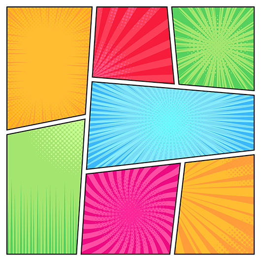
You don’t have to use rectangular borders for your panels. You can use jagged edges, round edges, or none at all to set off that panel from the others. You can also use an irregular grid, where the panels aren’t the same size. With this unusual layout, you can emphasize some panels while retaining flow.
Transitions are Important
A transition is how one panel moves to the next one and the relationship between each one. There are a couple of meanings a reader can infer by the type of transition you use.
Movement-to-movement
This transition follows a simple linear movement from start to finish. Each panel shows the next step of the process until it’s completed.
Action-to-action
This type of transition shows a single subject progressing through one action, like Tarzan swinging from branch to branch. Each panel will depict one part of the subject’s journey.
Subject-to-subject
This kind of transition goes much more in-depth into the scene, showing minutiae that a more action-packed panel might miss.
Scene-to-scene
This transition goes back and forth between characters or scenes. If there is a suspicious character outside a house, where the protagonist is making tea unawares, the panels might show the shady character’s approach to the house, counterpointed with panels of the hero pouring hot water into the teapot.
Aspect-to-aspect
An aspect-to-aspect transition shows multiple views of the same scene of action, giving more than one viewpoint as the panels progress.
Non-sequitur
This type of transition includes panels that are seemingly not connected. It gives a general introduction to a setting or world or is a transition from one key plot point to the next.

The Final Word
You need to think about many creative areas to create a well-balanced comic with a measured flow and the right density. Creative writing, artistic talent, and attention to detail, especially when it comes to layout, are integral in producing a quality comic, beginning to end.
Comix Well Spring will be with you on your comic book creation journey every step of the way. Contact us today to help make your dreams a reality tomorrow.

