How to Make Your Flyers Stand Out
December 18, 2020
Designing a professional-looking flyer is more challenging than it seems since it’s easy to underwhelm or overwhelm readers. Choosing the right combination of text and images for your flyer takes a little practice, especially if there’s a lot of information you want to include.
However, you can make your flyers stand out easily by making them bright and bold. Team up with a professional designer or use a business flyer template to create an eye-catching design that people pay attention to.
Full-Color Printing
Printing in black and white doesn’t catch potential customers’ attention as much as full-color digital printing. Create a flyer that uses bold yet professional-looking colors to convey your services and skills at a glance.
A full-color background is beneficial for getting noticed, but be careful not to make the background too busy. A lightly-textured background is fine as long as the text still contrasts nicely with it. Choose a color that’s reflective of your brand but still makes it easy to read your flyer.
Although photos of your team or examples of your work are preferable, use stock photos if needed to make the most of your full-color design. Images communicate your services much faster than text can and serve as an excellent focal point.
Marginless Printing
Trying to print flyers on a home or office printer results in flyers with at least a small white space around the edges. Flyers with backgrounds or large images on them will look much sharper if you use a professional printer that can print to the edge of the page.
This subtle touch makes your flyers look more high-quality and establishes the legitimacy of your business. This gets readers’ attention in ways that even text and photos can’t.
Try Bullet Points
Potential customers don’t want to be confronted with a wall of text, especially if you hand them a flyer quickly at a trade show or similar event. By using text carefully, you free up more space for photos and QR codes. Bullet points are the best way to organize information in an easy-to-read format.
Include up to eight bullet points summarizing your products or services on your flyer. If you include more than five bullet points, break them up into two columns instead of making them one long list. Make your bullet points a maximum of eight words each for maximum clarity.

Use Professional Fonts
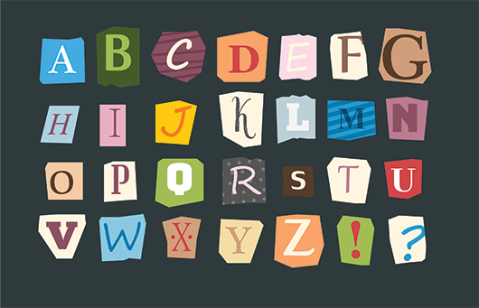
Novelty and script fonts are best avoided because they’re harder to read and don’t look professional. If your business or service is for weddings or other high-end events, then you can use a script font in small quantities on the title, but don’t use it for more than a sentence. Most of the time, flyers should stick to either serif or sans serif fonts, which are very popular in modern design.
Serif fonts like Times New Roman or Cambria have small lines at the end of each letter’s strokes, while sans serif fonts like Calibri and Arial omit these lines. Sans serif fonts look more modern than serif fonts, but serif fonts work well in small quantities or for businesses that provide professional services.
Printing Products People Love
Comix Well Spring is committed to providing high-quality prints for small businesses, independent creators, event hosts, and much more. We offer both black-and-white and full-color printing for flyers, business cards, booklets, and much more. Place your online order today so we can get to work taking your business to the next level.


